If you’ve spent more than five minutes scrolling through design boards lately, you’ve likely noticed a shift. The era of the “all-white” minimalist living room—while crisp and clean—is beginning to feel a bit clinical. Homeowners are craving warmth, but they aren’t quite ready to dive back into the heavy browns of the early 2000s.
Enter the most sought-after duo of 2026: Sage Green and Cream. This combination is the interior design equivalent of a deep, calming breath. It manages to feel both sophisticated and lived-in, bridging the gap between “modern chic” and “nature-inspired sanctuary.” If you’re looking to refresh your living room, here is why this palette is winning hearts and how you can master the look.
The Psychology of the Palette: Why It Works
Design isn’t just about what looks good; it’s about how a room makes you feel.
-
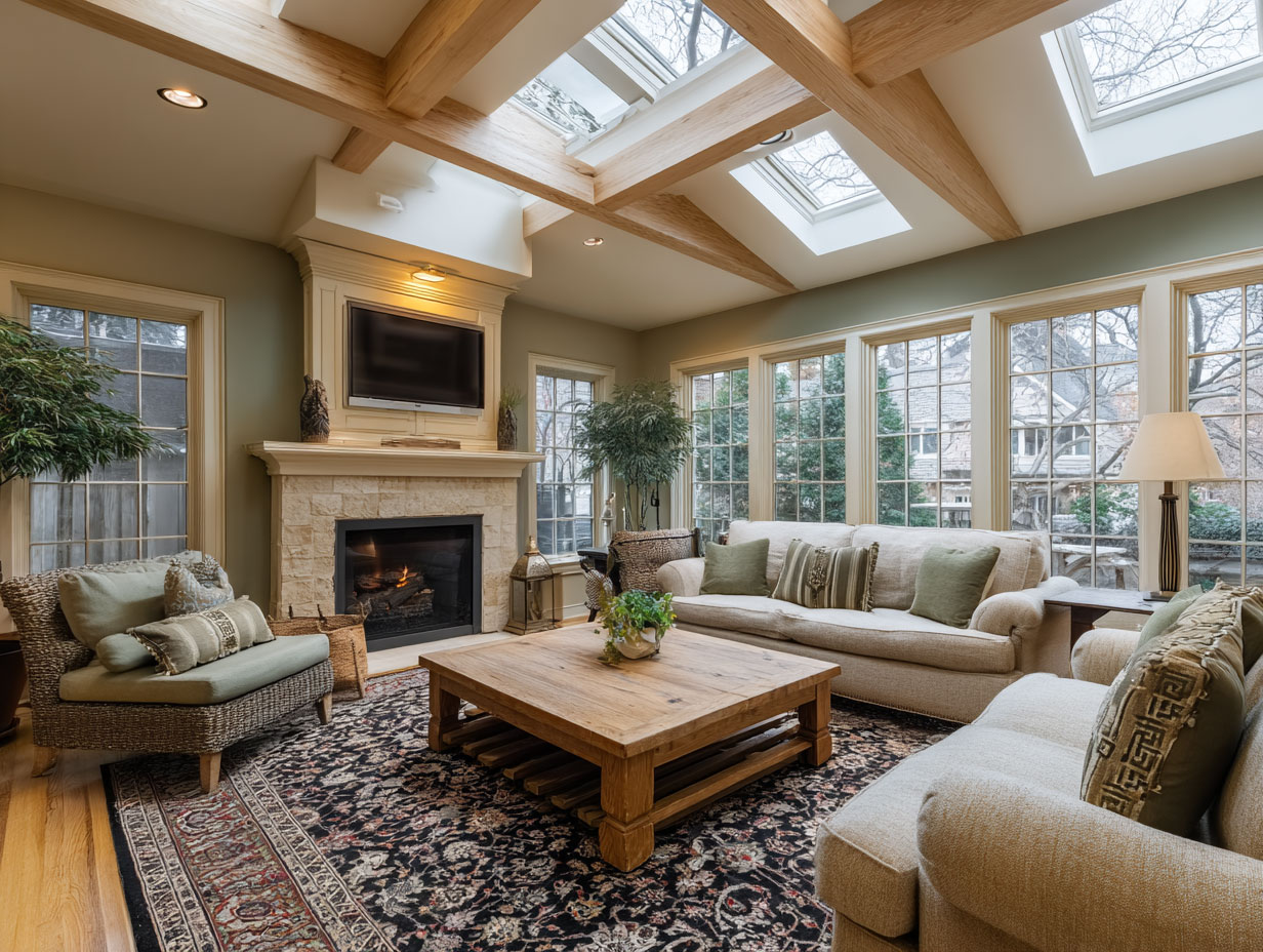
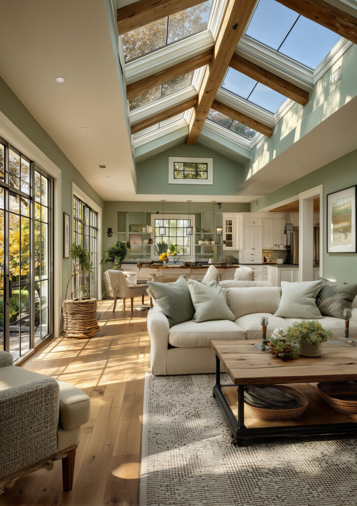
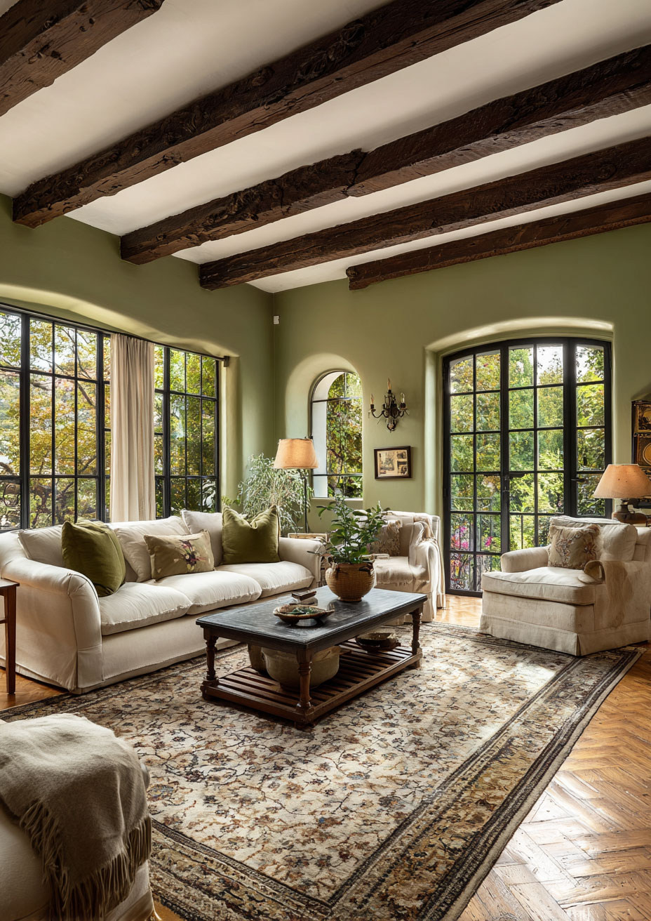
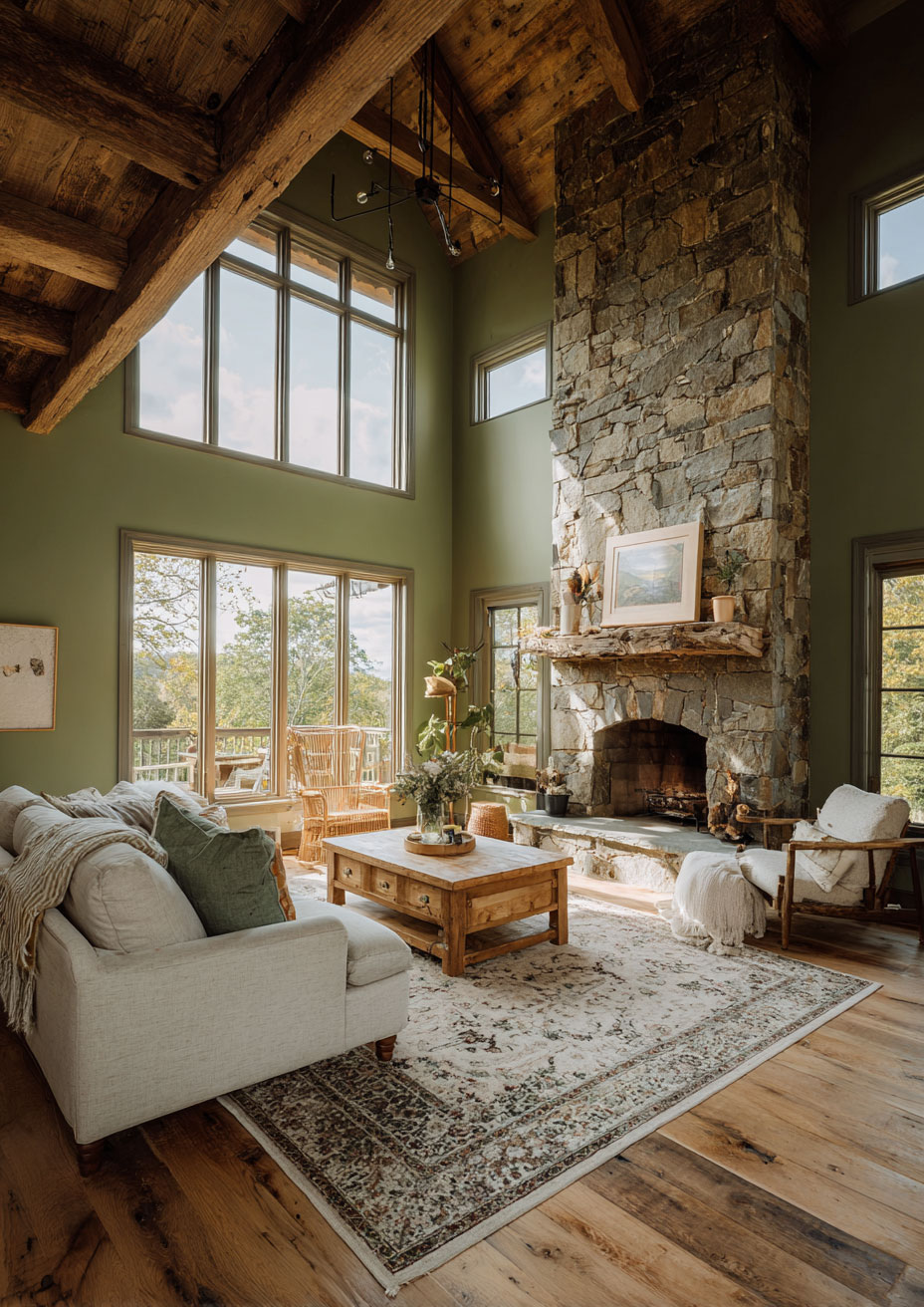
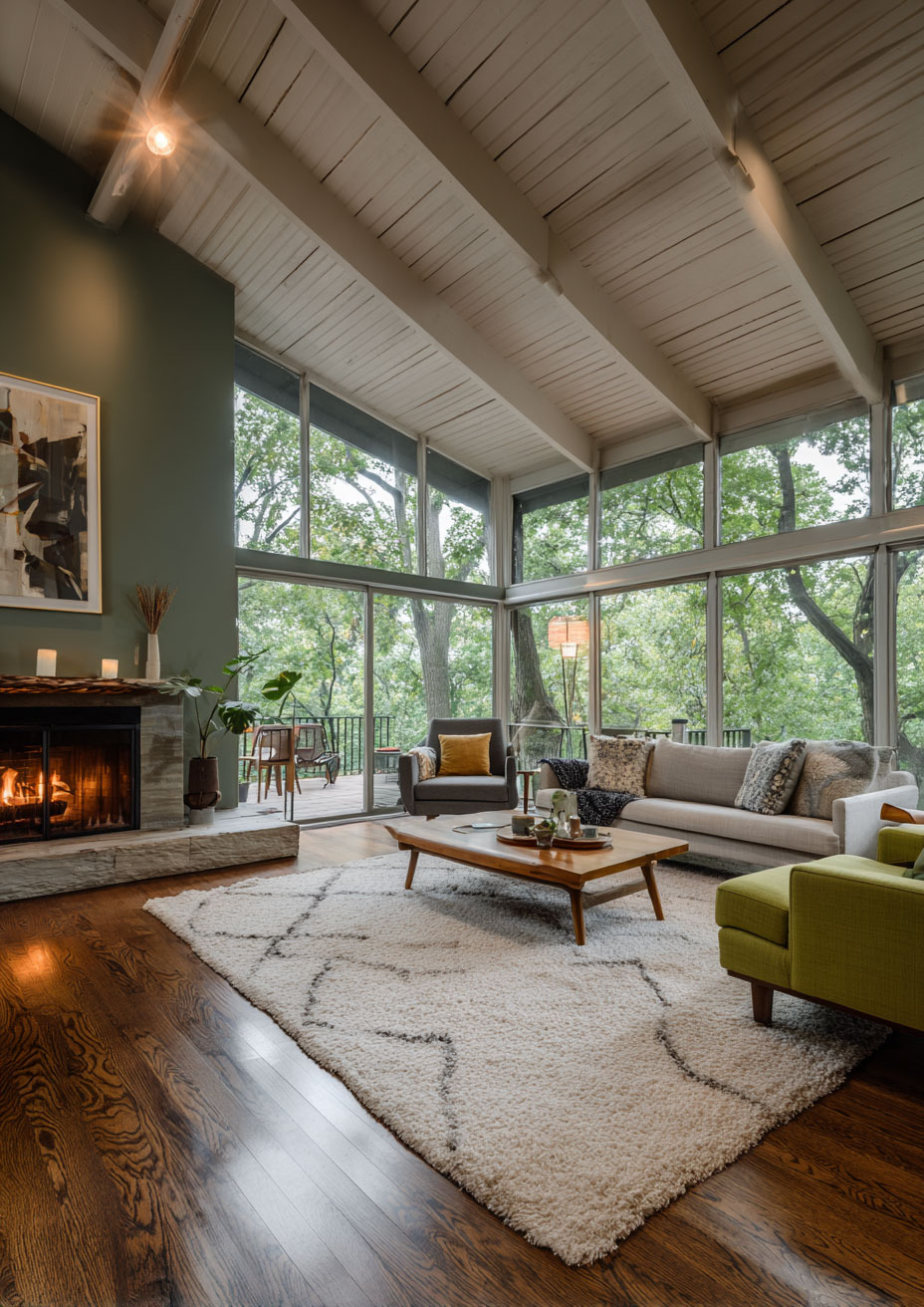
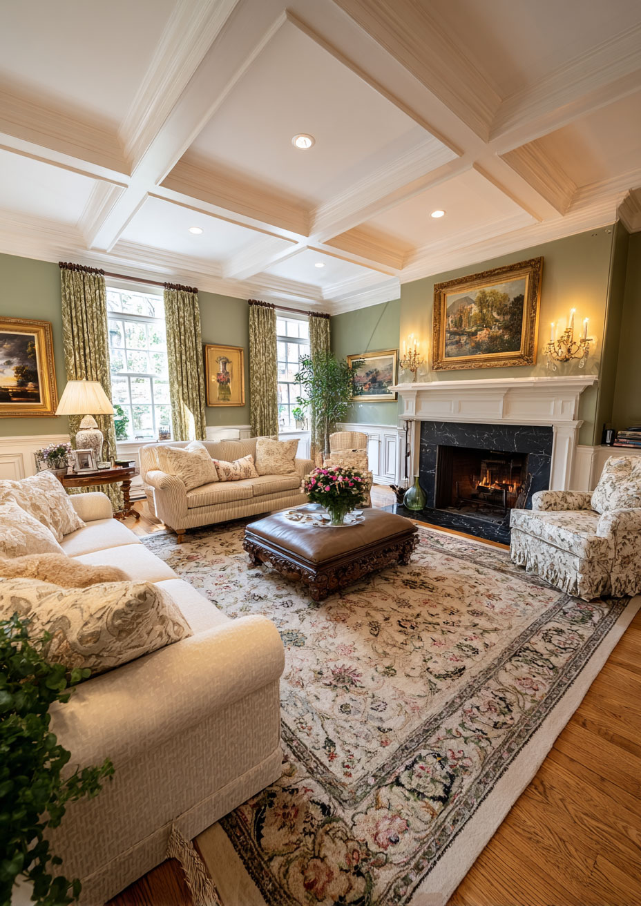
Sage Green: A muted, earthy green with grey undertones. It’s rooted in Biophilia—our innate human desire to connect with nature. Unlike a bright lime or a dark forest green, sage acts as a “soft” color that lowers the heart rate and promotes a sense of quietude.
-
Cream: Not to be confused with plain white. Cream has yellow or peach undertones that provide visual warmth. While white can feel “cool” or “sharp,” cream feels “buttery” and “inviting.”
When you pair them, the cream prevents the sage from looking too muddy, and the sage prevents the cream from looking washed out. It’s a perfect symbiotic relationship.
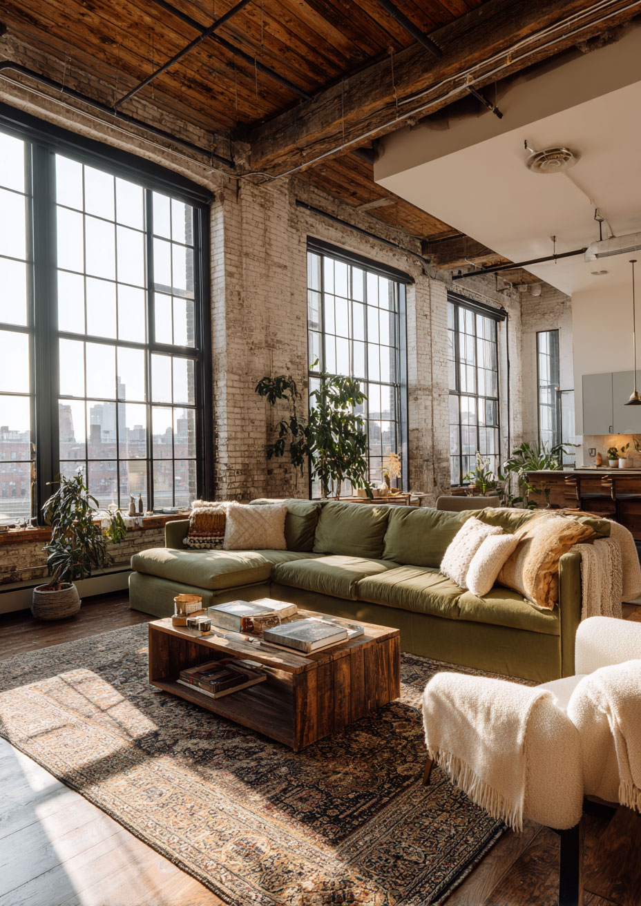
1. Choosing Your Foundation: Walls vs. Furniture
The first step in executing this palette is deciding which color will take the lead.
The Sage Wall Approach
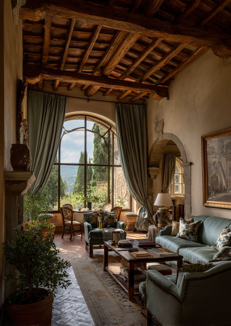
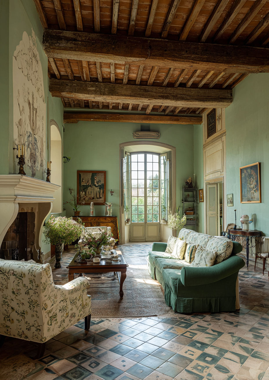
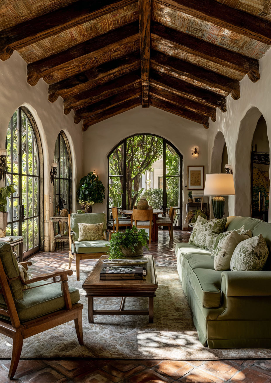
Painting your walls sage green is a bold but rewarding move. Because sage is so muted, it functions almost like a neutral. It provides a stunning backdrop for art and shelving. If you go this route, look for a “dusty” sage—think of the color of dried herbs rather than fresh grass.
-
Pair with: A large cream-colored sectional or linen-upholstered armchairs to provide a bright focal point against the green.
The Cream Canvas Approach
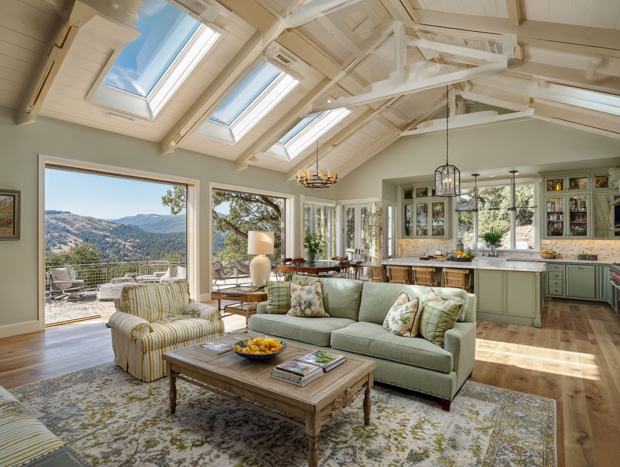
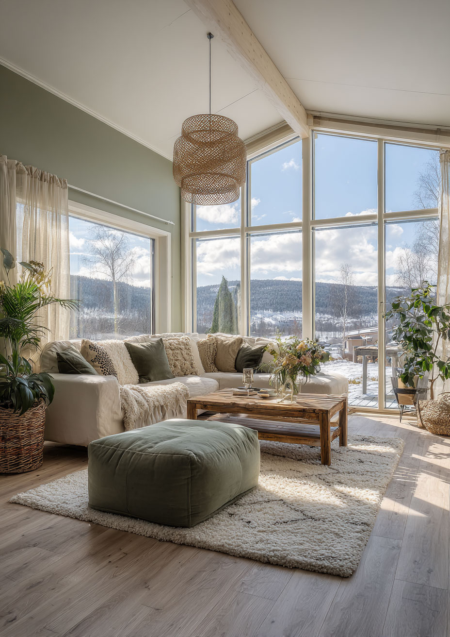
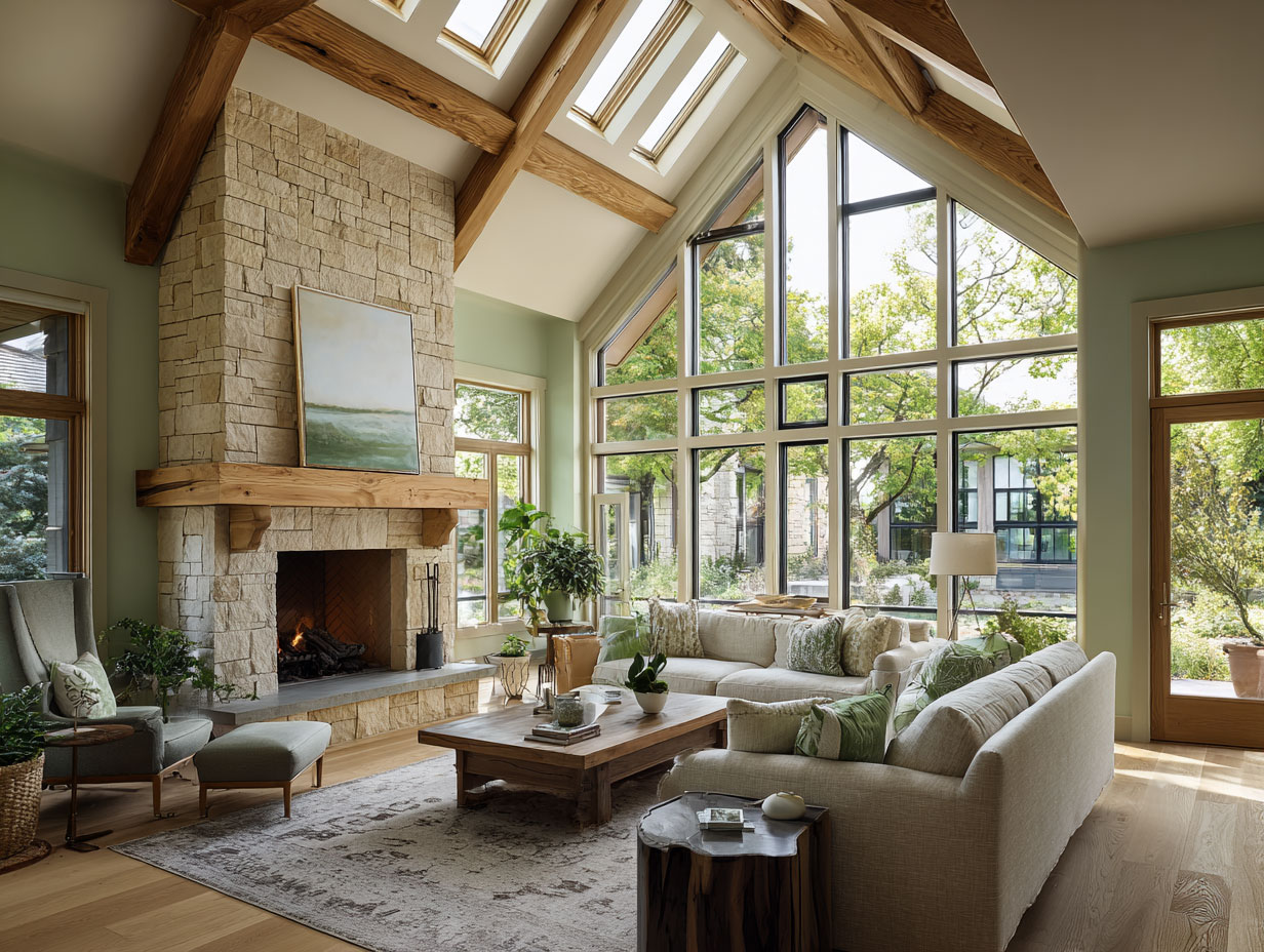
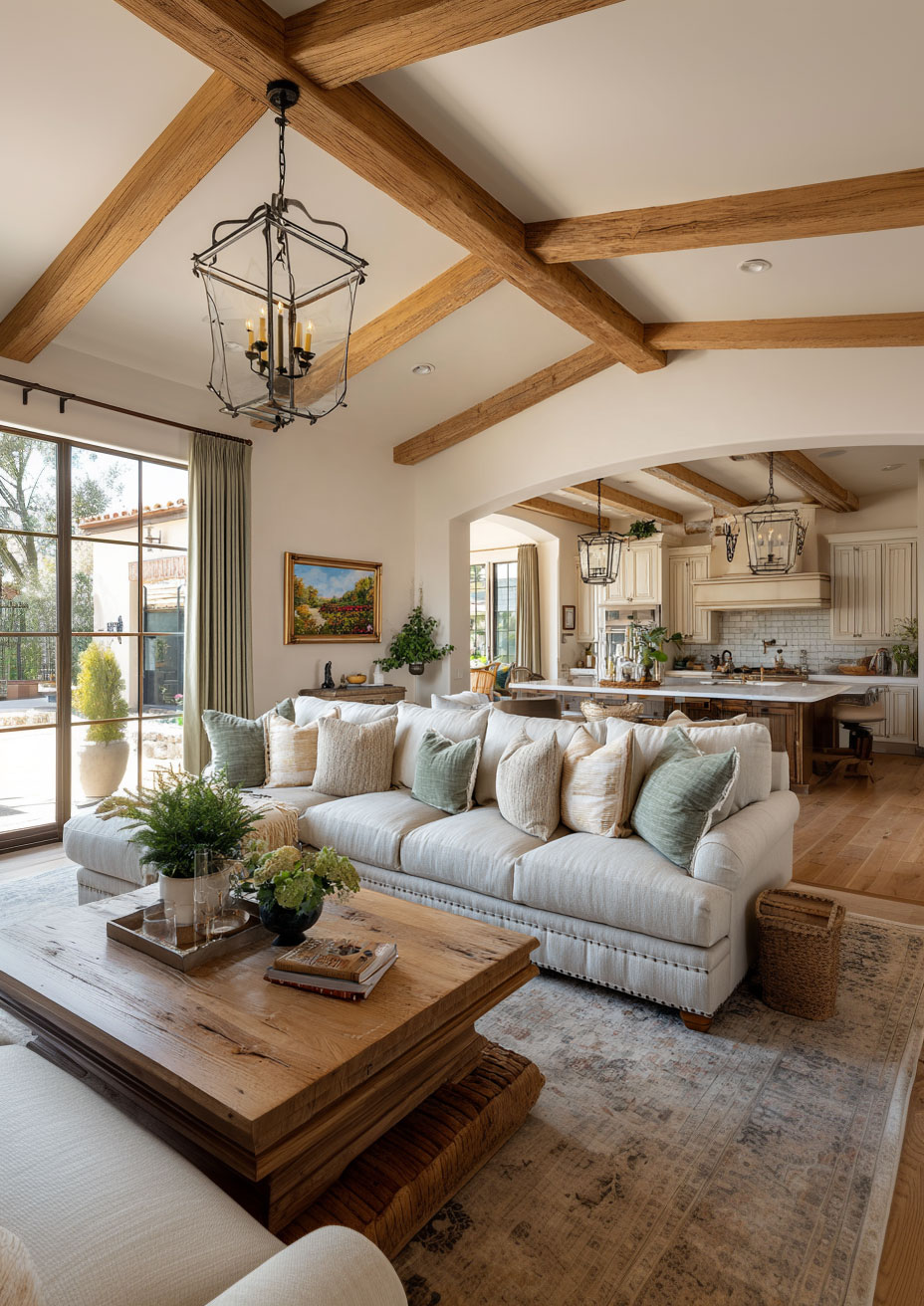
If you prefer to keep your walls light and airy, go with a warm cream (look for names like “Mascarpone” or “Swiss Coffee”). This keeps the room feeling spacious.
-
Pair with: A velvet sage green sofa. This creates a luxurious “anchor” in the center of the room that feels high-end and curated.
2. Textures: The Secret to Avoiding “Flat” Design
The biggest risk with a two-tone palette is that the room can end up looking two-dimensional. To make a sage and cream room look like it was designed by a pro, you must layer your textures.
-
Bouclé and Linen: Cream looks best in high-texture fabrics. A cream bouclé swivel chair or a heavy linen curtain adds depth that a flat cotton fabric simply can’t match.
-
Natural Woods: Wood is the “hidden third color” in this palette. Light oaks or bleached pines complement the cream, while dark walnut provides a stunning contrast to the sage.
-
Stone and Ceramic: Introduce cream through matte ceramic vases or a travertine coffee table. The “coldness” of the stone is balanced by the “softness” of the green walls.
3. The “Wildcard” Factor: Adding a Third Element
To prevent your living room from looking like a catalog page, you need a third “accent” color to break things up. Here are three directions you can take:
-
The Metallic Edit (Modern): Add matte black hardware or brushed gold light fixtures. Black adds a modern “edge” to the soft sage, while gold enhances the warmth of the cream.
-
The Earthy Edit (Rustic): Introduce Terracotta. A few clay pots or a rust-colored throw pillow will make the sage green pop and give the room a Mediterranean or Southwestern vibe.
-
The Moody Edit (Sophisticated): Small touches of Charcoal or Navy. A dark rug with sage accents can ground the room and make it feel more formal.
4. Lighting: The Make-or-Break Detail
Sage green is a “chameleon” color; it changes drastically depending on the light.
-
North-Facing Rooms: These rooms get “cool” blue light. In this environment, sage can look a bit grey or chilly. Ensure your cream elements are extra warm (almost a pale yellow) to compensate.
-
South-Facing Rooms: These rooms get “warm” golden light. This will make your sage green look vibrant and lush.
-
Pro Tip: Use “Warm White” LED bulbs (around 2700K to 3000K). Avoid “Daylight” bulbs (5000K+), which will turn your beautiful cream furniture into a harsh, clinical blue-white.
Styling Your Space for the “Pinterest Look”
If your goal is to create a living room that looks “perfectly styled” for photos, follow the Rule of Three:
-
The Greenery: It might seem redundant, but adding actual plants (like a Fiddle Leaf Fig or an Olive Tree) next to sage green walls creates a beautiful “tone-on-tone” effect.
-
The Gallery: Use cream-colored mats in your picture frames. This creates a visual “break” between your art and the sage wall.
-
The Throw: Draping a chunky cream knit throw over a sage sofa is the easiest way to instantly make the room look “cozy-luxe.”
Final Thoughts
The beauty of sage green and cream lies in its longevity. It’s a trend, yes, but it’s one rooted in the timeless colors of the natural world. It doesn’t demand your attention with neon hues or stark contrasts; instead, it invites you to sit down, stay a while, and actually live in your living room.
Whether you’re doing a full renovation or just swapping out some pillows, this palette is a foolproof way to elevate your home’s “calm factor.”